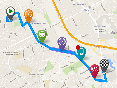
Driving Event Icons & Route Lines

At my previous job we built an app that tracked, measured and scored your driving. This was used to calculate discounts for your car insurance.
For each trip, events such as harsh acceleration, hard braking, distracted driving, etc. were plotted on the route to show you where you could improve your driving and why you received a specific score.
When I started, the icons we were using to indicate events were generic diamonds with a color for the event category and size for the event severity. The route lines were a plain black, 1pt thickness with straight joins.
You can see the original style of the icons and route lines in this shot.
I wanted to improve usability, understanding and overall look and feel of the events and routes. So here's what I did:
- Added icons to the event markers which, combined with the colors made them more recognizable
- Got rid of the sizes to indicate severity and instead used the red (!) to indicate high severity events only
- Added drop shadows and some slightly gradients to the event marker to modernize their look
- Widened the route line and rounded the corners to make the route look more natural and cover up where the route might not look 100% accurate
- Changed the route line to blue with a slightly darker stroke to make it stand out more from the map
Check out the rebound to see these in context.


