OKC | Statement Type

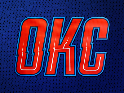
I had a go at redesigning the OKC statement jersey logo text. Something about the real logo text doesn't sit right with me... The K seems way too dense compared to the O and C.
This is an adaptation of a typeface I've been working on for a while.


