


Distantly Yours Logo Redesign—2a

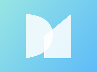
Like the original logo, these shapes are abstractions from the letters “D” and “Y,” the initials of Distantly Yours. Since most of my branding is online, transparency is probably fair play, so I’m experimenting with how to leverage that.


