ReactSymbols UI Kit - Released!

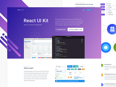

Hi Dribbble, After releasing Symbols & Styleguides I teamed up with my good friend @Vlastimil Fiser (@vlafiser) and we (he) coded up everything in React! So, without any further ado - let me present you our brand new release: ReactSymbols UI Kit.
As you can tell from the name: This package is all about React UI components. You’ll find most of the elements from Symbols & Styleguides package coded into React. All types of buttons, labels, tabs, inputs and much more to make sure that you get the main coverage of all the frequently used UI elements across the web spectrum. Each component is build with endless possibilities to give you a freedom to change easily every aspect. For example buttons comes in 3 sizes, all validation states, with properties for icons, border radius, colour, label and many more. All properties are listed in Documentation.
Coming Soon (Next Week): One of the best features we cooked together is the same principle from Styleguides, you can change most of the components to match your brand by changing one line of code!
Wanna learn more? Full landing page overview + documentation: http://reactsymbols.com
What’s inside this package?
- 17 Ready to use components
- Customisable colour theme of the whole UI Kit
- SASS & CSS files for each component separately
- Font Awesome and Material icons support
- Detailed documentation for each component
- Full setup video tutorial
- Lifetime support + Free future updates
- Sketch file (from Symbols & Styleguides)
PS: If you like this kit please spread the word and like it by pressing L key 🔥


