Save the Date vector


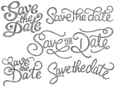
Finally getting round to posting this: first vector draft in one of the proposed colour palettes. I played around with extending a couple of the strokes, but I went against adding extra flourishes in the end (partially because the two capital letters will also need to work alone as a relatively contained element).
Should be getting client feedback soon but in the meantime, I'm noting things to fix/refine. In particular, there's something about the middle 'e' that seems slightly off and the main diagonal of 'S' is a little weird. Let me know if you see anything else that needs improving - full b&w version.


