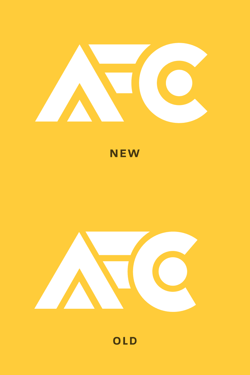
Logo refinement
After years of using this logo, I felt I could improve it. I expanded the white-space to make the logo more readable, and matched the line-weight and geometry across the letterforms.
Posted on
Dec 19, 2017
More by Adam Fisher-Cox View profile
Like


