Scribd- Iconography

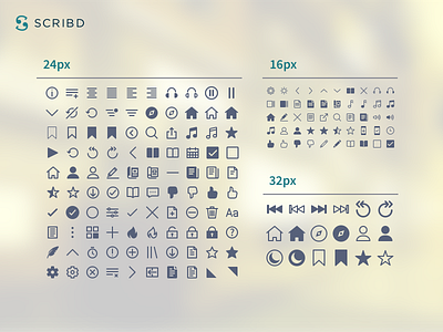
I think this is basically the full icon library I developed at Scribd-
barring a few exceptions that didn't really fit into this image (I'm looking at you, giant icons. Shame on you.)
The execution of this library was pretty different others I've made in that Scribd used specific icons at specific sizes for specific use cases (i.e. pause@16px, pause@32px, pause@48px as 3 separate assets) rather than establishing a flexible system using a single asset (i.e. pause at 16px would be drawn with a 1px stroke, which would double to a 2px stroke if implemented at 32px, 3px if implemented at 48px, and so on.)
This is sort of a double edged sword. On the plus side, this shows in a binary sense that we do/don't have a specific size of an icon available for a feature. If we don't have it, we produce it on the fly and add it to the library. So there is a lot more asset tracking in this approach (and updating an icons design means uploading 4 assets.)
In this way, a flexible single-asset system takes far less upkeep, and you don't run into "missing" sizes. However, you'll end up encountering a lot of limitations where you want a 20px icon and it just doesn't work in the pixel scaling logic- and you'll end up with a ton of half pixels.
Anyway, just some thoughts on that! In conclusion: icons.


