ClickQA Multiplatform Brand


Multiplatform brand for a responsive, mobile and desktop application.
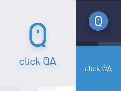
The challenge Shape the service and brand including every single user flow, from idea to product. It’s a cloud-based, collaborative solution, with several kinds of users and privileges. Take the client’s original idea and first versions and shape the solution and ‘personality’ from there. The solution Map and layout all the different user-flows needed. A DESIGN SYSTEM Document the solution giving the developer team flexibility and autonomy to interpret and apply the design for future functions. Concept and create every single element, interaction, animations and micro-interaction needed for the app, end to end: Sign-ups, Sign-in, onboarding, empty states, feedback (warning, errors, alert). Definition of colors, typography, font sizes, buttons, with clear indications for when and how to use them. Characteristics CONTEXTUAL SCHEMES Only by giving a fast look the user will understand in what context and on which application the user is located. We used different color schemes to alert by context the purpose of the current interface, bright, dark and colorful schemes have each one a different meaning. Use the dark mode to imply the user should be hands-on the task. Excluding black and white, these are the six standard colors in the base palette: Primary, Secondary, Active, Success, Warning, and Error. Use the light mode to deliver information. Excluding black and white, these are the six standard colors in the base palette: Primary, Secondary, Active, Success, Warning, and Error. RESPONSIVE The UI system should work on different breakpoints: mobile, tablet and desktop. COHESIVE Everywhere you go, we kept consistency so the app feels as a part of the same brand. SCALABLE The design patterns are developed in a way it can be scale easily for new functions and content.


