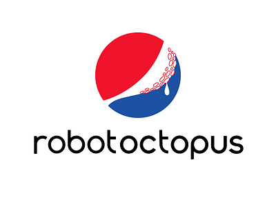
Robot Octopus (Pepsi version)
Logo Practice: Pepsi!
As far as this logo is concerned, the type was super fun and easy to draw (Thanks Pepsi!) However, the letter spacing was a bit of a nightmare due to all the ellipses needing overshoot (It's still not nearly done in my opinion, but I need to get started on a separate project. )
I think this is the last logo practice for a bit. I had another idea over the weekend that I want to get started on which might take most of this week.
Anyway! Hopefully I can share this new idea pretty soon! Happy Monday!
View all tags
Posted on
Mar 12, 2018
More by Thomas Gatewood View profile
Like


