Level Up


This is a concept I've spent some time working on recently based around online learning and courses. I've been a huge fan of online learning for quite some time, through University to where I am currently in my career, and primarily use online resources to teach myself the vast majority of skills I use on an everyday basis. That being said, here is the landing page for 'Level Up'.
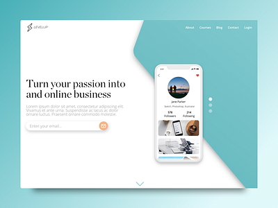
Similar to concepts I have worked on in the past, 'Level Up's' landing page features a brief call to action where users can enter their email to immediately sign up to the site's newsletter. The idea here was to go for a less is more approach, whereby the user would be drawn to the several mobile UI screens, showcasing some internal functionality of 'Level Up', and as a result be drawn to signing up for the service.
The branding is focused around a simple matte colour palette. With white being the primary colour used across across the site, accented by the use of teal, and black text. I wanted to keep the palette relatively simple and bold here, so what stands out is the content, which in the case of online learning and courses, is the most important part for a site like this.
Be sure to follow me on Social Media:
Instagram | Behance | Medium


