


Craigslist Redesign

I feel like the Craigslist's web design is very polarizing - one one hand, it's pretty brutalist and ugly, but on the other hand, it seems like it was designed to be as lightweight and accessible as possible.
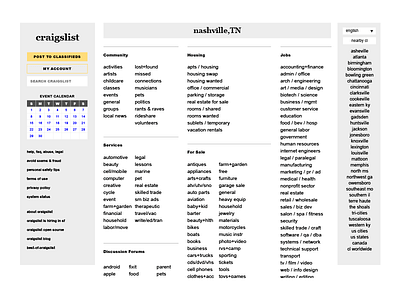
I like the intent behind that, but I've always thought it was executed poorly. So as a challenge to myself, I decided to redesign the homepage of Craigslist by only changing things I could change with basic CSS. That mean no layout changes, no images, and no custom fonts.
So this is the same layout as the current Craigslist - with some more comfortable spacing and simplification of typography. It's just Georgia and Arial, available on every computer, but I tried to give them a little more space to breath. I also tried to correct a couple UX issues I'd run into using the site myself - namely, it always takes me 5-10 seconds to remember how to post something.
I got rid of the IK blue used rampant in the current site - I know, I know, it's part of the brutalist look, but the gray palette is really nice on the eyes. I made section headers simpler but stand out a little more. Other than that... it's really just more padding everywhere.
I would love to know your thoughts! Is Craigslist an untouchable design in your eyes, or do you see room for improvement?


