Dashboard Healthcare


Case study out now, Do have a look into my Behance profile. Here is the link
*********************************************************************
Hello, People out there.
This is another dashboard exploration for the SCIO-A healthcare app.
What's the problem?
1. In the previous version, you can see that it's too much of cards.
2. The search and some other icons are on the top so it'll be little difficult for those who have the bigger phones.
3. Too much clutter on the dashboard.
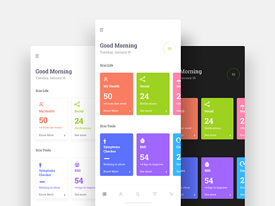
The Approach
1. Here I categories the cards.
2. You can access the most used functions like search and profile from the bottom navigation. 😉
3. This design has more breathing space and looking neat.
* I've used Roboto Slab (Just an experiment)
I'm still confused with the colored and the white cards version. So here is where you can help me out.
Comment what you think is looking nice.
A. Coloured Cards
B. White Cards
C. Dark UI
Don't forget to show some love "❤️".


