And again

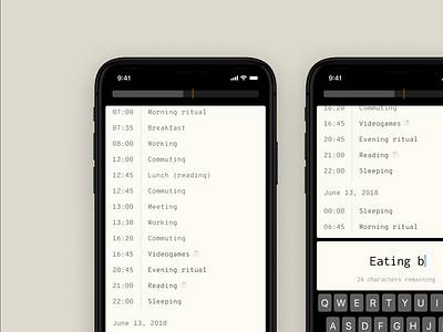


Another stab at my time journaling app. The original mechanism of tracking was a Moleskine notebook. The notebook was ridiculously simple—to add an entry, I would just write in a time, and write in the text, with a new page for each day.
The downside of this was that editing was hard, elaborating was hard, and tracking a day full of lots of different activities sometimes meant I needed a new page. Analysis was also a pain; lots of hand-keyed data.
I returned to that original data entry model here. This interface is purely focused on entry. I wonder if I might keep the mobile app simple, and just focused on entry, and leave all the analysis to be done on a desktop. To explore.
Also, new aesthetic? Trying to get closer to a notebook feel.


