Fitwise Training Business Card
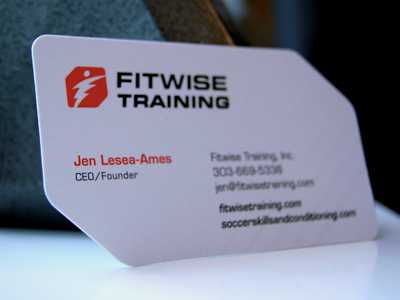

Logo design and custom diecut business card for a sports conditioning company. The logo mark represents the human movement combined with the letter "F" shape.
Business card was printed with clear spot gloss UV on the logo and the accent diagonal lines. Larger different view attached.


