


Thirty Logos Space - Final Design


Hey there folks! I recently commenced with a project called "Thirty Logos", to learn the process of logo design and make myself valuable for applying to studios. Unfortunately the site http://thirtylogos.com has shut down, but you can find all the briefs at https://twitter.com/ThirtyLogos
---
BRIEF
So this brand is called Space and they're building co-working offices so that freelancers and small startup companies have a stunning office to work out of without paying the big bucks to buy or lease a large building.
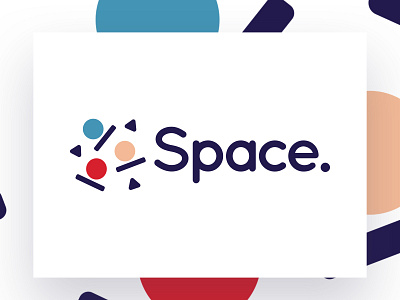
For the Space logo, they wanted to capture the idea of a personal, modern and fun shared office space. They were open to either using the text "Space" to represent the company or some sort of icon.
---
PROCESS
So why did I go with these concepts?
1. The idea of using triangles and circles made me think a lot about the simplification of a person.
2. The circles is the shape that represents a person, the rectangle is like the table sitting and the triangle is more or less an object nearby them.
3. I used more of a soft, fun font to go with the overall soft shapes presented in the logo.
4. I used more rounded corners to keep the idea of fun in the overall mood of the logo.
In the next post I will show a mock-up with the patterns of the logo been used on it.
---
FAQ
Where do I get feedback especially doing brief generators based logos?
I get feedback from either design communities or simply asking friends or family members


