


Thirty Logos : The Grind - Concept Sketch


Greetings. I recently commenced with a project called "Thirty Logos", to learn the process of logo design and make myself valuable for applying to studios.
Unfortunately the site http://thirtylogos.com has shut down, but you can find all the briefs at https://twitter.com/ThirtyLogos
---
BRIEF
This brand is called "The Grind" which they prides them self on natural and local ingredients. For their new logo, they did not want to use any browns.
Because a lot of coffee shops uses brown, so they wanted to use different colors such as oranges, greens or other earth tones to make the brand stand out.
The logo will be used as the store sign, on menus, and on coffee cups and merchandise.
---
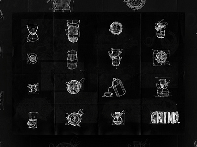
PROCESS
I first started with a simple mind-map, which you can see in the 4th attachment.
After noting down the important information, I commenced drawing shapes and icons related to the keywords.
And as I continue to sketch more ideas, I combined it with reference to have a clearer picture for what I am sketching.
In the next post, I will show the concepts I chosen to refine and design.
---
FAQ
Where do I get feedback especially doing brief generators based logos?
I get feedback from either design communities or simply asking friends or family members


