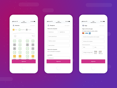
Purchase Funnel


Working on the responsive application, we found some fun challenges to solve, such as the seats-diagram for bus trips.
Previously, this diagram, was built with html tables for desktop and mobile, this is because they were two different applications, the problem now arises because we needed a single component that could adapt to different screen sizes.
The main solution in _css_ was to use `Grid Layout`, defining the layout respectively at each breakpoint, `large screens` for desktop and for mobile and tables `medium-screens`. This new structure was simply implicit but due to a problem with the poor support of old browsers, `Grid layout` was discarded.
So we decided to use `Flexbox`, having the structure that we originally used with `Grid Layout` was not enough, we had to add some containers and reorganized div elements to achieve this.
Here's a shot with part of the flow of the purchase funnel, which is made up of the seats selection, the passenger section and ending with the payment form.


