Sharp.ink Logo

Development for Sharp.ink, previously RareInk, is back on track!
The idea for the logo was kept intact. The inner drop was made bigger in order to maintain readability on smaller versions. Colours were changed to better reflect our new direction.
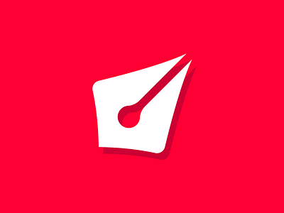
This logo uses web safe colours. Background: 255, 0, 51 (pure red) Shadow: 204, 0, 51 (strong red)