Homeplate Peanut Butter Honey

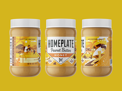

Recent rebrand we did for HomePlate Peanut Butter. The client wanted the brand to have more impact from a shelf level. We redesigned the logo a bit to be bolder in a small space. We infused a lot more color with a playful illustration style. And the white caps helped let the product pop out on dark shelves. Honey uses an outdoor beach scene full of surfing, sand volleyball, calling on the beach with a subtle nod to their baseball roots.


