Mihlo - Logotype Grid

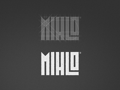
Logotypes - Logos where the primary element is not the mark but the text itself. This year i discovered a love for them. And on this case both me and the client agreed to put the spotlight on the text instead of the mark, the result feels beautiful, organic and raw, which suits the brand perfectly.
The golden spiral helped to have the best proportions for this one and the negative / positive space lines are very reminiscent of the crops behind the tortilla production 🌽
Would you like to see these Logotype breakdowns more often?