Forgotten Star Brewing II

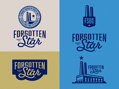
I went back to the drawing board on the type for the lockup. The old version (after looking at it) felt clumsy and I wanted something that could stand alone. Things feel like they hang together much better now. Also, I'm much happier with this new color palette. It feels much more akin to Minnesota.


