TOFileKit - August Update

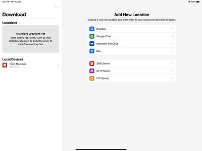

A bit of an update to my last picture of TOFileKit.
Like I mentioned earlier, I decided to move away from the old-school iOS design language and embrace the new complexion reduction style that had started to become prevalent in the TV and App Store apps.
This turned out to be the right call, because this sort of UI became a first class citizen in iOS 13. Apps like the new reminders app use the contrast between white and grey to separate columns of content instead of explicit lines.
I also decided to can the "Activity" menu from the right hand side. During development, it started becoming obvious that that list would probably spend a large amount of time being empty (if there were no downloads), and this would actually be quite wasteful. That space could better be spent for the main file list, where allocating extra space for potentially long file names would be a better user experience.


