Fitness studio logo

Body reform fitness - Identity System.
New Identity project for Body reform fitness that I was very thrilled to work on even though the project was not approved.
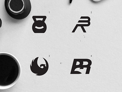
Each concept has its own story:
1. Some link with fitness industry with a smile. Client wanted his clients to feel warm and welcomed arround him .
2. This one looks very interesting. He wanted one concept to be very modern and very minimalistic and simple. Logo has been designed in italics because I believe the industry as itself,represents the movement and that is why I did it in italics.
3.One idea he suggested is to do a phoenix as his mark. Phoenix represent words such as: strenght,improvement,reborn...
This concept is just phoenix.
4.This one is bold BR monogram with a phoenix head in it. Again this one is drawn in italics because it represnt movement.
Which one do you think should work the best?


