Semoss – Brand Exploration 02


Hi there folks!
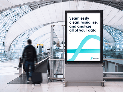
Here's another recent brand and identity explorations developed for Semoss – an online data visualization platform.
Together with amazing Balkan Brothers, we've explored multiple variants of how the final identity might look like. In this direction, I aimed to amplify the flexibility benefit of the platform - this direction translated the agile aspects via fluid and minimal visual language. The curved S-mark is inspired by a sinusoidal graph.
Stay tuned for more!
Cheers,
Michaela


