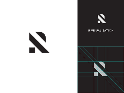
R Visualization Lockup (mark + logotype)
After several rounds of exploration, chose this mark and type as the logo for architecture and rendering firm "R Visualization."
It's appropriate and memorable. It's sufficiently different and recognizable. It's made up of only simple shapes.
What's your take? I love your honest feedback.
brandingdesign
identitydesign
lockup
logo
logodesign
logolockup
logomark
logomarks
logos
logotype
logotype design
logotypes
mark
markdesign
visualidentity
View all tags
Posted on
Oct 23, 2019
More by Bertram Christoffersen View profile
Like


