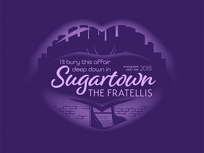
Sugartown

Sugartown.
This one by The Fratellis has been getting a lot of attention around here lately. It just drips with a certain seductive bubbly atmosphere that I thought would be cool to try to capture in graphic form.
You know how we used to post song lyrics whenever the mood of a song clicked with us just right and then everyone else would see those lyrics completely out of context and cringe because it always read like edgy poetry? Well this is that but a d v a n c e d.
I've also been itching to exercise my typography muscles (which, I guess.. fingers) lately. I found myself watching a presentation by Bethany Heck about using multiple typefaces in a design and breaking that weird design "rule" of just giving yourself one or two and felt inspired to try to make that happen.
That's right. I used 3.


