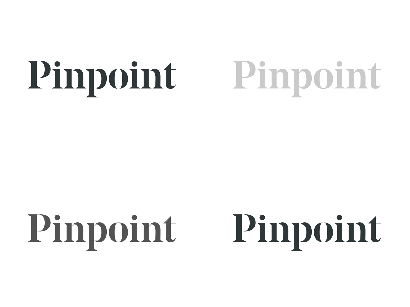
Pinpoint Logotype Mods
After a thorough brand analysis, our goal was to create a welcoming, yet forward-thinking identity that sets Pinpoint apart and wins on design in a highly competitive space.
For the logotype we started with Noe Display. And while it balances the classic attributes of serif type with more modern liberties, it still felt too traditional for a progressive brand such as Pinpoint.
To solve for this—and to make the logotype unique to them—we detached the bowls and shoulders of various letterforms, and adjusted the top of the "t" to reflect the triangles found in the logo mark.
Read all about our work with the fantastic Pinpoint team.
View all tags
Posted on
Dec 5, 2019
More by Focus Lab + Odi View profile
Like


