Project #34

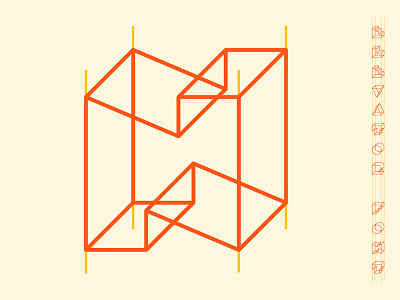
I created a font that is loosely based on temporary construction elevators by suspending each character by four parallel bars. To help with legibility I kept each character as simple as possible by using clean geometric shapes. I then chose colors that would be found on a construction site like the warning orange color normally seen to help with the overall concept. There's a nice optical play that happens if you stare too long, you'll see that each character could be seen as a bird's or worm's eye view.
Click here to see the rest of the font and poster:
http://DaydreamsandNightschemes.com/Project-34


