You’ve probably seen tons of wordmark logos in your lifetime. Many of the biggest brands out there have chosen this type of logo to represent their visual identity. But why did they go with a wordmark over a symbol for example? And what does a wordmark logo technically mean when it comes to design?
If you’re a graphic designer offering logo services, this is extremely important to know because you’re expected to choose the right kind of logo that best supports your client’s brand identity.
In this post, we’re focusing on the wordmark logo (or logotype) — diving deep into what it means, it’s best use-cases, and some handy tips to keep in mind in the design process. Lucky for us, experienced wordmark logo designer Paul von Excite joins us to shed light on this powerful typographic logo.

Paul here — I’m a type designer and lettering artist from the Netherlands with a passion for not only beautiful but also usable wordmarks.
What is a wordmark logo?
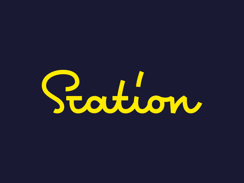
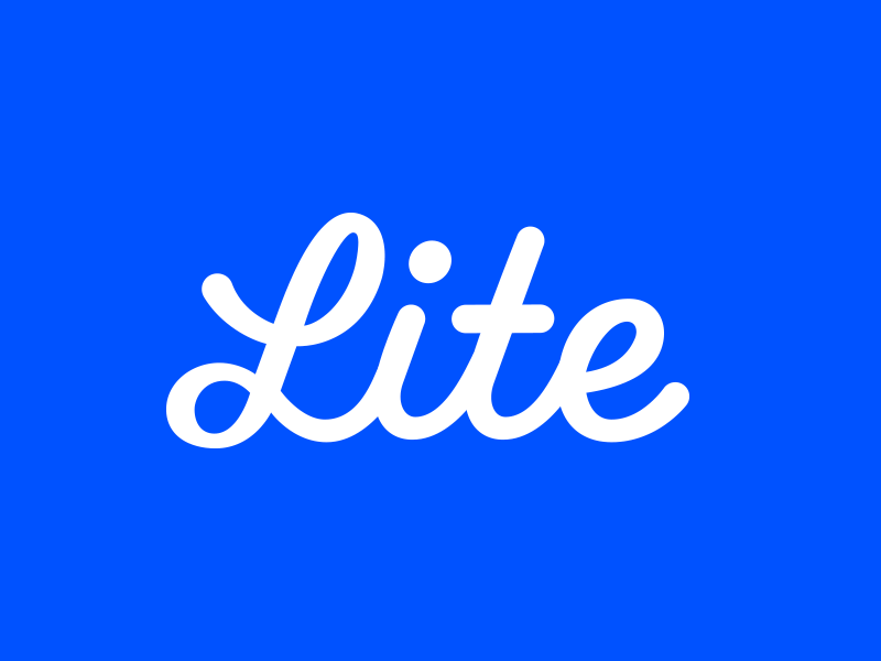
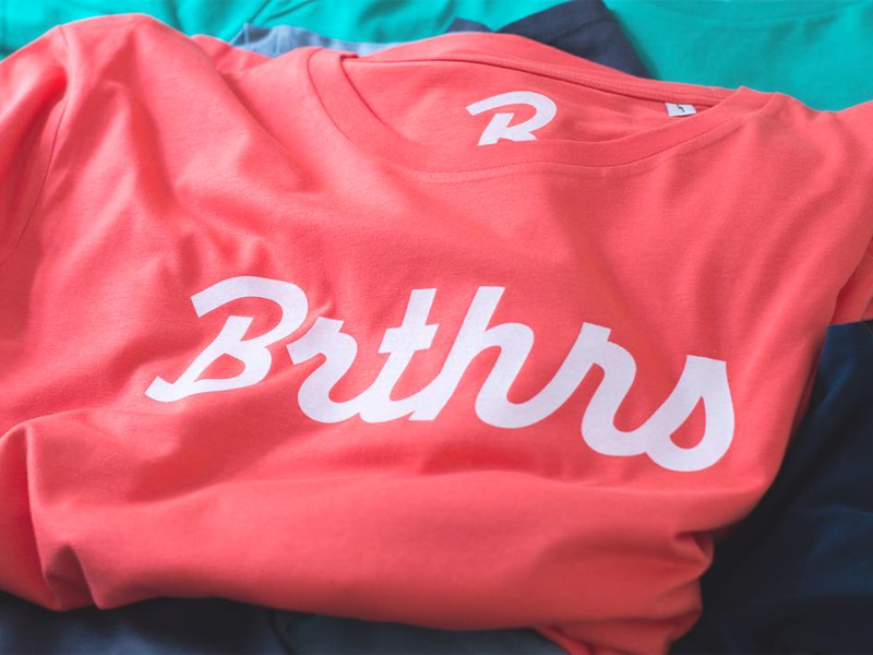
A wordmark or logotype is, in essence, the name of a brand designed with the use of unique typography. There are a lot of different type-styles used for wordmarks — the most common being script, sans-serif, and serif. Some well-known iconic wordmarks are for example; Coca-Cola, Google, and SONY.
Why design a wordmark logo as opposed to using graphics?
Both types of logos have their own advantages, and the choice between a wordmark or brandmark is subjective and relative to what the business wants to portray. Using a wordmark is a good decision if you have a new business and the name of the business needs to get out there. Because of their simplicity, wordmark logos are easy for customers to understand.
What are the best use cases for a wordmark logo?
Length is very important. Wordmark logos work best when the business name is short and distinctive, and sticks in the mind of potential customers. A long company name could become overly complicated quick, resulting in an unprofessional appearance. A good wordmark for me is beautiful to look at, memorable, and useable within various display options.


How to choose the right typestyle
Start with describing the business. Just like colors, every typeface is associated with an adjective. For example, the color purple usually associated with luxury. When it comes to type, I could picture a thick uppercase serif typeface or a solid, clean sans-serif uppercase typeface to represent luxury.
In order to take advantage of these visual associations when it comes to choosing the right typeface, it is very important to understand your target audience.
Any tips for designers interested in exploring wordmark logo design?
Since a wordmark is text-based, the most important factor to keep in mind while designing these logos is readability. Also, don’t try to over-complicate the design. Keep it simple and memorable to make it stand out.
What does your wordmark logo design process look like?
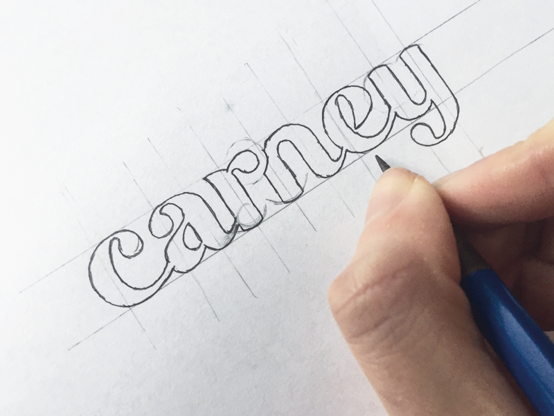
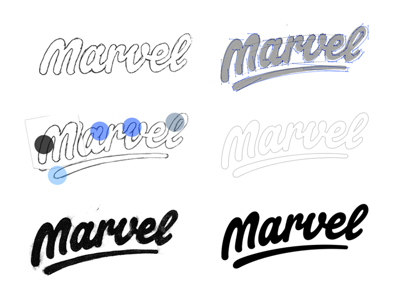
I like to start with gathering inspiration which goes hand in hand with early sketches and remarks about certain findings. Quickly after or in between, I start creating more detailed sketches which become the foundation for the next steps.
If everything goes to plan, I should have a few detailed sketches ready to trace digitally with the Pen Tool. Everything from getting the actual concept sketch digitally to revising and polishing the concept is done within Adobe Illustrator. Only script and lettering concept sketches actually get traced using overlay. The sans-serif concepts are built from the ground up using shapes in Adobe Illustrator using the sketches as visual reference.
Takeaways
Now that you have a better understanding of why and when to design a wordmark logo, here are a few takeaways you’ll want to remember:
- Consider a wordmark for new businesses with a short name.
- Carefully choose a style of type that will support the brand’s message
- Readability is key: Don’t overcomplicate the design and keep it easily legible!
Want to keep up with Paul? Find him on Dribbble, Instagram, and at paulvonexcite.com.
Find more Community stories on our blog Courtside. Have a suggestion? Contact stories@dribbble.com.


