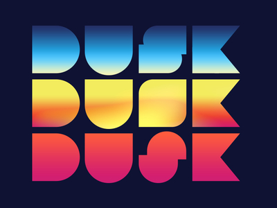
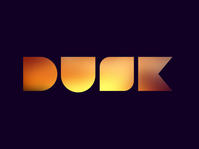
So, I've had a couple comment that the "s" on the middle version of this logo isn't legible enough so I came up with a couple alternates. Personally I don't mind people having to work a little to see the "s" i kind of feel that it gives ...
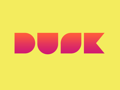
So I'm starting my own company, Dusk Interactive. I'm hoping to make some kick-awesome stuff in the next year.
Here is a logo concept that I've had in my head for a while. I want your feedback. What you think?