Who are you?
I’m an independent calligrapher and lettering designer, focused on solving communication problems through letterforms, currently living and working in Valencia, at the Mediterranean coast of Spain. As a letterforms enthusiast, I’m constantly trying to explore different approaches when it comes to drawing or writing letters, always keeping an eye to the historical tradition of writing and lettering, creating a nexus between the past and the present, and applying my contemporary perspective on each of my projects. I practice almost every day and combine my commissioned works with side projects to improve my skills and develop my craft, so I can offer to my clients the best quality as possible.
When I was in my teens, I fell in love with graffiti and urban culture, as well as punk and hardcore music. Then, I started drawing distressed letters, observing and reading DIY fanzines, gig posters, flyers and record covers, and I’m still doing it!
What are you working on?
I’m currently finishing a book cover for a big Spanish publishing house. The book is a compilation of classical Spanish poetry, so the main element is the title, written in calligraphy with an organic and passionate feeling. Meanwhile, I’m working on personal letterings, exploring different ways of drawing letters, and I just started to work on my very first typeface.
Choose a favorite shot of yours. Why is it a favorite?
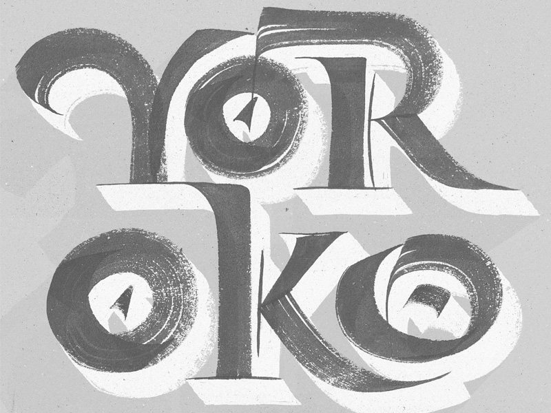
This shot was created for Yorokobu, a cultural and thinking Spanish magazine. I really enjoyed working on this cover, as I combined analog and digital tools to create an organic but powerful lettering, intensifying the textures of the brush and ink.
Tell us about your setup. What tools did you use to create the shot (e.g. hardware, software, pens, paper, blowtorch)?

I use different tools depending on the project, but I always start my projects working by hand. I use brushes, calligraphy pens, inks, gouache, mechanical pencils and a wide variety of papers. In regards to the digital tools, I use an iPad Pro with Procreate and Astropad, and a 27” iMac with a Wacom Intuos Pro to develop all my sketches in Glyphs, Photoshop and Illustrator.
I have two different desks: one to develop all my sketches and original artworks comfortably, and another one for my digital work.
Choose a favorite shot from another Player. Why do you dig it?

I love this shot by Luke Ritchie because the boldness on the letterforms and the general layout, I really like chunky lettering compositions and this really caught my eye!!
Find Joan on Dribbble, Instagram, and at joanquiros.com.
Find more Interviews stories on our blog Courtside. Have a suggestion? Contact stories@dribbble.com.


