App release
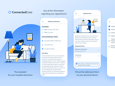
The Connected Care brand is mainly built on shades of blue, which generally gives a very peaceful vibe to the designs BUT for the App Store, the color palettes seemed to be slightly cold and distant. This is why it was necessary to add a pinch of warmth and coziness with the new yellow tone :) Hope you like it (If you want to check the real app and the shots, it's vailable in AppStore Germany).
app
app shots
branding
break
couch
cozy
flat illustration
flat vector
mobile
mobile app
onborading
relax
store
ui design
ux design
vector art
vector illustration
View all tags
Posted on
Oct 18, 2021
More by Andrea Lagunas View profile
Like


