Thirty Logos : The Grind - Final Design


Greetings. I recently commenced with a project called "Thirty Logos", to learn the process of logo design and make myself valuable for applying to studios.
Unfortunately the site http://thirtylogos.com has shut down, but you can find all the briefs at https://twitter.com/ThirtyLogos
---
BRIEF
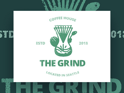
This brand is called "The Grind" which they prides them self on natural and local ingredients. For their new logo, they did not want to use any browns.
Because a lot of coffee shops uses brown, so they wanted to use different colors such as oranges, greens or other earth tones to make the brand stand out.
The logo will be used as the store sign, on menus, and on coffee cups and merchandise.
---
PROCESS
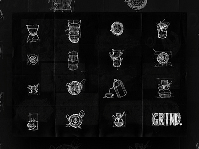
In the second attachment you will see the concepts I chose to expand on. The reason I went with these, because they captured one part of how coffee is mate.
I could have go with a grinder shape language, however that would have been too cliche or same as any other coffee shops.
In the first attachment, you see how all the concepts came together with a little bit of grunge effect on the overall shape.
In the 3rd/4th images you see the logo been applied on real world objects, to get a better feeling of what it might look like.
---
FAQ
Where do I get feedback especially doing brief generators based logos?
I get feedback from either design communities or simply asking friends or family members