Thanks to our friends at BB Agency for sponsoring this blog!
Imagine stumbling upon old photos of yourself, and you can’t help but laugh—or maybe even cringe—at what you once considered the height of fashion. Back then, it felt right, but looking at it today, it just speaks of a different, very distant era. It’s a feeling us creatives understand all too well when drawing parallels between personal style and branding. After all, the essence of branding is deeply rooted in the concepts of identity, character, or personality.
No matter if you’re spicing up your personal brand, carving out your freelancer identity, or revamping the face of your studio or agency—the core tenets of brand development and refresh hold true across the board. This article dives into key brand refresh strategies for those looking to revise their public persona, further illustrated through reflections on BB Agency’s recent brand refresh and website redesign.
Know Your Reasoning and Purpose
Pinpointing the rationale behind your brand refresh should be the starting point. This insight shapes every other aspect of the process, making it coherent and purposeful. In other words, a well-thought-out rationale breathes life into your brand, aligning any updates you make with your evolving narrative and strategic ambitions.
Speaking from our recent experience with the BB brand refresh, it was a strategic move to showcase our maturity and readiness for deeper partnerships. Our earlier branding, although functional, missed a sense of purpose that left it feeling a bit unremarkable. It just fell short in capturing the essence of who we’ve become, so it was time for an upgrade.
This shift aims to position us as an end-to-end partner for digital transformation, evolving from a service provider to a strategic ally. With this renewed focus, we infused our offerings with more motion design and reengineered our website on an updated WordPress platform. These changes reflect our commitment to adaptability and top-notch quality, mirroring our full-cycle capabilities.
Visual Identity Changes
Refreshing your visual identity is a powerful way to signal your brand’s maturity and fresh strategic direction. It’s about aligning your brand’s look and feel with its current positioning and future aspirations. Modifying your visual identity through logo updates, color palette revisions, and typography changes can greatly influence brand perception. Here’s how.
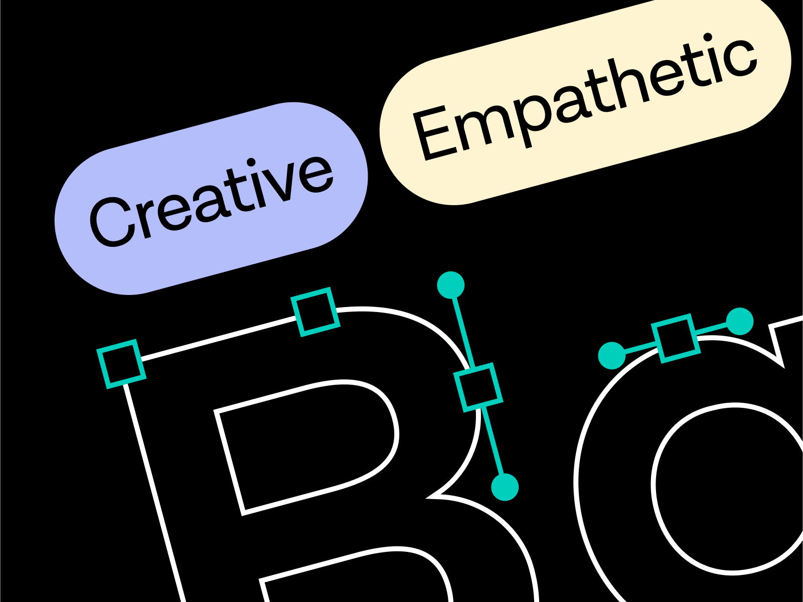
- Logo evolution: As your logo is often the first interaction people have with your brand, even minor tweaks can significantly impact brand perception. An update to the logo design can reflect your growth, new direction, or refined focus. Consider subtle changes that modernize your logo while maintaining brand recognition.
- Color palette revision: Revise your color scheme to align with your brand’s new positioning and aspirations. Color choices should not only boost recognition but also convey the emotions and values associated with your brand. The updated palette should be versatile enough for various applications while maintaining consistency across all brand touch points. Go for colors that offer stronger expression and test out combinations to see how they work across scenarios.
- Typography changes: Typography can significantly impact how your message is received. Choosing the right typeface can help convey your brand’s personality—whether it’s authoritative, playful, sophisticated, or [fill in the blank]! Except for aesthetics, consider the readability and accessibility aspects, too. Your chosen fonts should be easy to read on various devices and sizes. Besides that, it’s better to limit the number of typefaces used to maintain a cohesive visual identity.
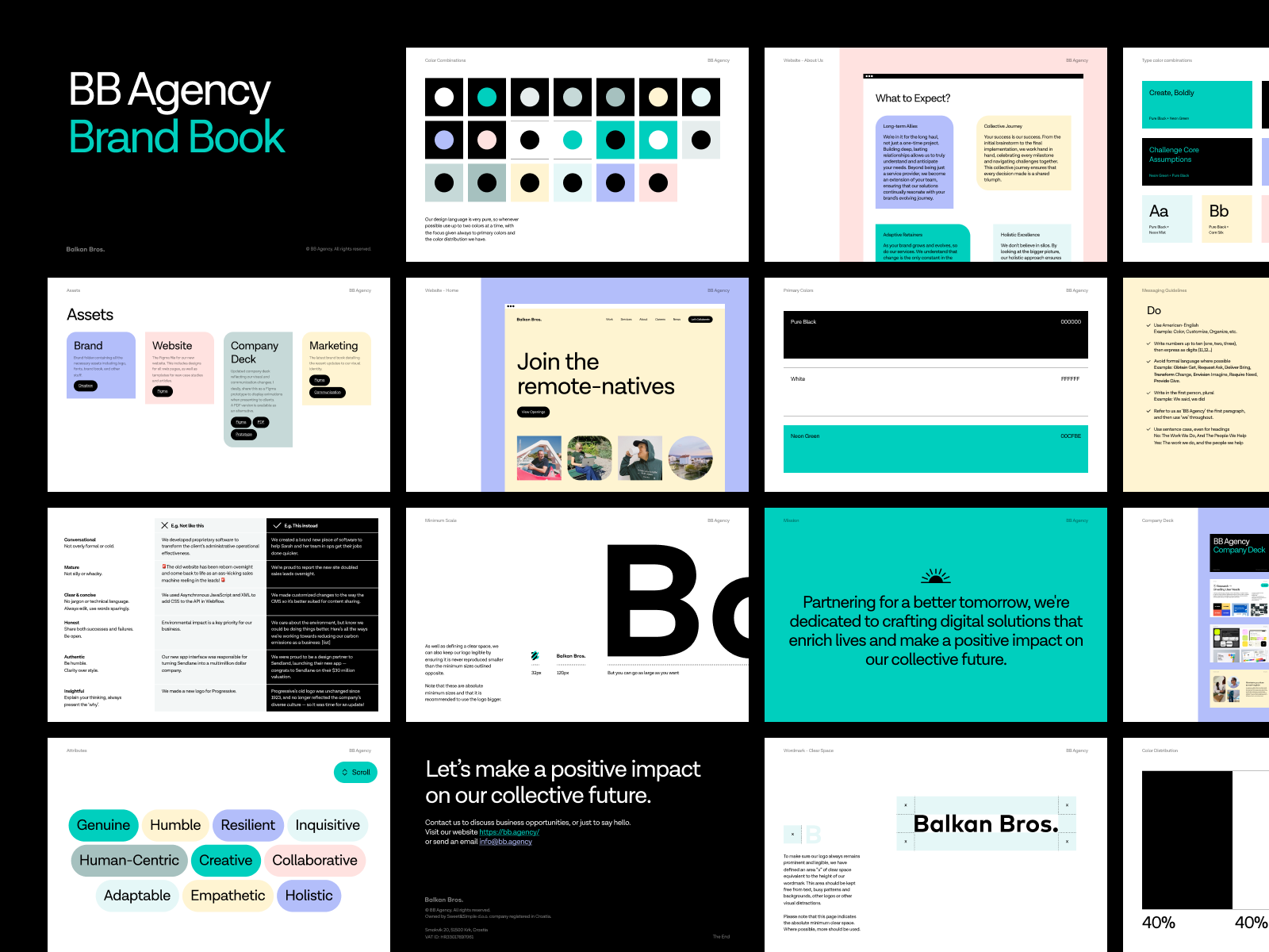
What We Did at BB
As for the logo, we chose not to update our design, opting instead to maintain and further grow the legacy that has defined our brand since 2016. While we tackled different aspects of brand uplift with varying levels of intervention, we decided to keep the consistency in certain key elements, including our logo, which remains unchanged as a deliberate choice in our brand evolution.
In updating our color palette, we made some subtle but impactful changes. Realizing our signature BB Dark Green is overshadowing the client work in our showcase, made us rethink our approach. To ensure our portfolio took center stage, we shifted to a more subdued backdrop of pure Black and White, with some hints of color here and there. The update reflects our brand’s maturity and versatility, which improved our website’s clarity and gave more flexibility to our marketing materials.
As for the font, we kept the Lota Grotesque font across our website and communications, enhancing our typography use to match our marketing needs. It was the adjustments in typography usage, not the typeface itself, that marked our evolution. This geometric, approachable sans-serif font supports 219 languages, fitting our global agency profile. We’ve increased our website’s base text size from 20pt to 24pt for better readability and accessibility, adapting to industry trends. The shift to a pure black-and-white color scheme also boosts the clarity of our typography, infusing our presentation with both flexibility and a mature aesthetic.
Website Redesign Essentials
A well-thought-through website redesign is crucial for showcasing your brand’s growth. It should mirror your strategic development, level up user experience (UX), and incorporate contemporary UI design principles. Additionally, it offers a perfect opportunity to demonstrate your skills—emphasizing certain digital experiences, like motion and interactivity, to boost storytelling. Here’s how to tackle these key aspects successfully.
- UX Improvements: If you’re redesigning an existing website, by now you probably know your audience and have a good idea of what they interact with, where they spend the most time, where they drop off, etc. Use analytics, user feedback, and usability testing to inform the redesign process, simplifying navigation and ensuring the information architecture logically flows from one section to another.
- UI Enhancements: Your UI should reflect your updated brand identity, including your new color palette, typography, and logo. Consistency in these visual elements across all pages reinforces recognition. Rely on color, contrast, typography, and spacing to guide users’ attention to important elements and actions. A well-defined visual hierarchy enhances the overall user experience and facilitates conversions.
- Motion and Interactivity: Motion design and interactive elements need to be purposeful, not distracting. Use animation to enhance the storytelling on your site and guide the user journey, giving intuitive cues and engaging site visitors more deeply with your content. If motion design is part of your offering, integrating these elements into your website acts as a portfolio showcase. Consider the performance implications and ensure these elements are optimally integrated for smooth loading and interaction.
What We Did at BB
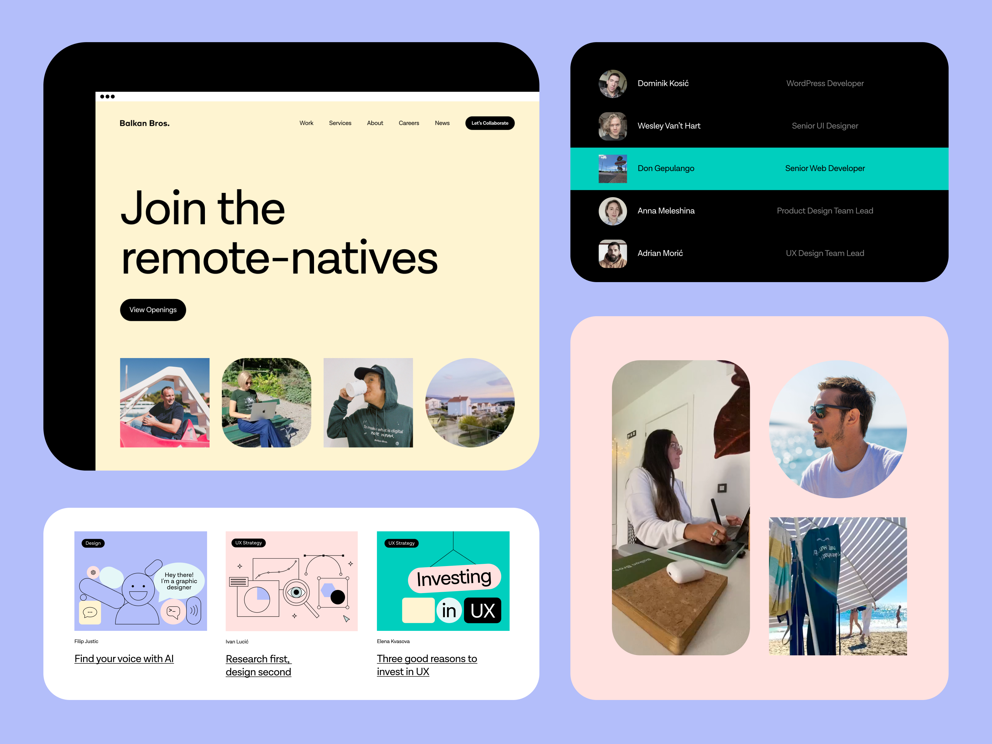
We’ve revamped our website to enhance user experience, making navigation simple and interconnected, and simplifying our blog’s taxonomy to improve readability and engagement. Highlighting our commitment to transparency, we’ve restructured our services into five core pillars—Research, Branding, UX Design, Interface Design, and Development—offering a clearer view of our capabilities. We also decided to introduce an “Achievements” page to showcase our successes, client testimonials, and project results, validating the effectiveness of our ways of working and building trust with potential clients.
In our UI revamp, we went for a more natural evolution, refining the existing structure with key changes for a subtle transition. We restructured most pages and content presentation, introducing a new fluid grid system for full scalability across devices. Our approach reflects an industry shift towards larger, more impactful visual presentations, balancing clean design with dynamic content. We believe these updates improve our site’s visual appeal and place our offering, results, and collective identity center stage.
Integrating motion design across our digital presence underlines our commitment to dynamic storytelling. This shift not only enriches the user experience but also aligns with our focus on being at the cutting edge of digital design and communication. We did experience a slight impact on performance but found the trade-off worthwhile.
Communication Style Evolution
Revising your verbal identity and overall communication style is another facet to consider to maintain relevance and resonance with your target audience—especially as your brand evolves. It’s about fine-tuning how you convey your brand story, values, and offerings. Here’s how to refine your tone of voice and content strategy.
- Tone of voice refinement: As the aspects of your brand personality evolve, so should your tone of voice. For example, you might be moving away from being formal to being more approachable, so your tone of voice should communicate the newly established attributes consistently across all platforms. Conduct a tone-of-voice audit across all your communications to identify any gaps and areas for improvement. Use these insights to create clear guidelines that include examples and scenarios for practical application.
- Content strategy adjustments: Review your existing content to ensure it aligns with your updated brand positioning and tone of voice. Your content should reflect your brand’s strategic shifts while making sure it provides real value to your audience. Beyond showcasing your work and capabilities, focus on addressing common challenges, sharing insights, and fostering two-way conversation where appropriate. Plan your content calendar with topics that resonate with your target audience, incorporating various formats such as blog posts, videos, or podcasts.
What We Did at BB
We revamped our tone of voice and communication style to reinforce our partnership-focused narratives. This approach puts collaboration at the forefront, highlighting our role as a strategic partner, the results we deliver, and the alignment with our mission and values.
When it comes to content strategy, as we’re shifting our focus toward establishing ourselves as industry thought leaders, we’re starting by shedding more light on our projects, thought processes, and operational methodologies. With that in mind, we aim to share genuine insights into our daily collaborations with clients, the nuances of building and growing an agency, and more.
And That’s a Wrap
A brand refresh is a strategic endeavor that realigns every aspect of your identity with its evolved mission, values, and value prop. Through purposeful changes, clear strategic objectives, and a holistic approach to all the key areas, a brand refresh can significantly boost your positioning and recognition. As you tackle these shifts with clarity, purpose, and strategic foresight, you are more likely to make an impact.
If you’d like to see some of these best practices in action, take the BB website for a spin!
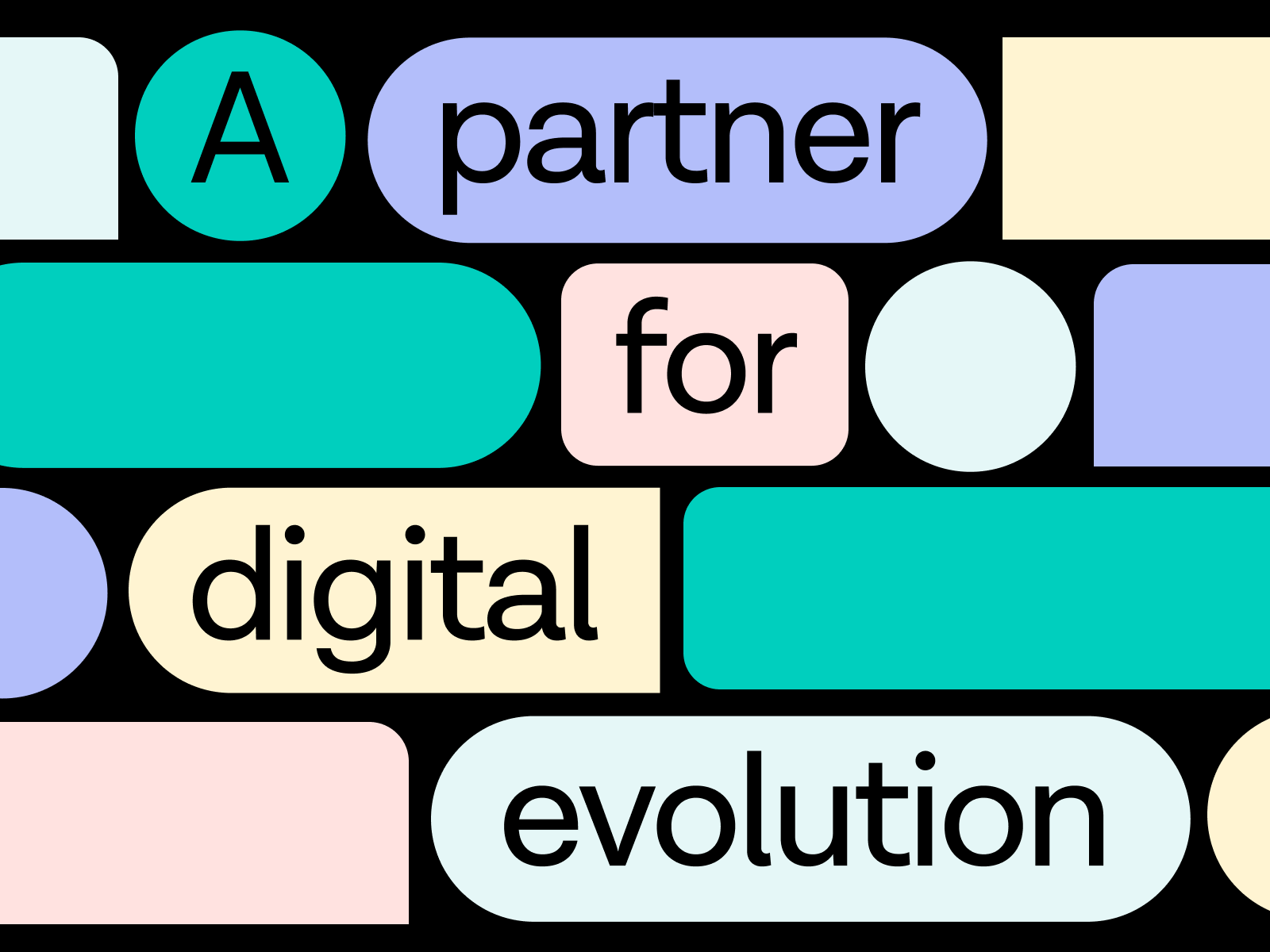
BB Agency is a partner for digital evolution, merging creativity, strategy, and technology for holistic growth. By joining forces with companies dedicated to addressing real human needs, we rely on our full-cycle digital capabilities to shape brands, experiences, and products that enrich the lives of millions every single day. Our approach is rooted in a deep understanding of our clients’ unique challenges and opportunities, geared towards driving holistic change and creating lasting value.
Find more Community stories on our blog Courtside. Have a suggestion? Contact stories@dribbble.com.


